
Guide to 2 Color Kitchen Cabinet Ideas
You've seen the photos. White uppers, navy lowers, and suddenly the whole room looks taller and more interesting than any single-color cabinet run ever could. That's the promise of two-tone cabinets.
But the reality is trickier than it looks on Pinterest.
Get the pairing wrong or mess up where each color goes, and you end up with a kitchen that feels chopped in half. The principle is sound, but execution matters. As of 2026, two-tone cabinets remain one of the most requested kitchen updates.
The difference between a magazine-worthy result and a costly mistake comes down to a few specific rules.
Quick Answer
A two-tone kitchen uses two different colors on cabinets. The most common split is light uppers and dark lowers. This makes the room feel taller.
Popular pairings include white with navy, gray with white, and cream with dark green. Always test colors in your own lighting first.
Why Your Two-Tone Kitchen Might Look Off (And How to Fix It)
The biggest problem isn't picking the wrong colors. It's ignoring the existing elements in the room. Your countertops, backsplash, and flooring all have undertones.
When you add two cabinet colors, you're adding more variables.
If your countertops are warm beige with brown veining and you pick cool gray cabinets with blue undertones, the whole kitchen feels disjointed. The same goes for pairing bright white cabinets with a cream backsplash. The mismatch becomes obvious.
Start by identifying the dominant undertone in your fixed elements. Is it warm (yellow, beige, brown) or cool (blue, gray, green)? Once you know that, your two cabinet colors should both fall on the same side of that divide.
You can still have contrast, but the undertones need to agree.
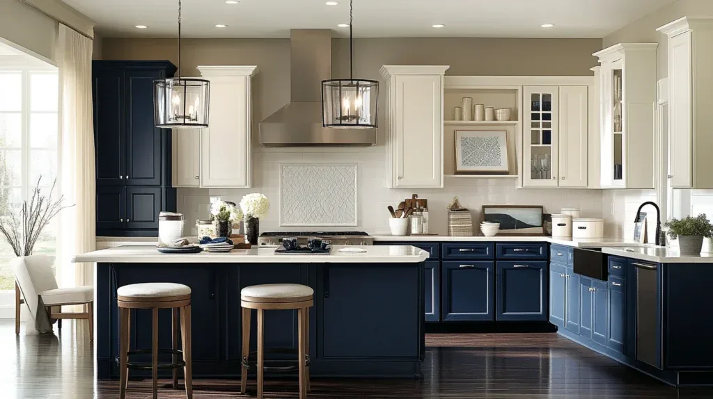
Image source: Bing (Web (fair-use with source credit))
Another common mistake is ignoring the floor. Dark lower cabinets against a dark floor can make the kitchen feel like a cave. Light uppers against a white ceiling can wash out the room.
If your floor is dark, a medium-toned lower cabinet might work better than pure black. If your floor is light, you have more freedom with darker lowers.
The Golden Rule of Two-Tone Cabinet Design
The lighter color should go on the upper cabinets, and the darker color on the lower cabinets. This isn't just a trend. It's based on how our eyes perceive weight and space.
Light colors feel airy and recede. Dark colors feel heavy and anchor a room. Putting dark uppers makes the ceiling feel lower and the room feel top-heavy.
There are exceptions, but they require a specific layout with lots of natural light and high ceilings.
If you're working with a standard 8-foot ceiling, stick with the light-top-dark-bottom formula. It's the safest bet. You can always add a dark accent cabinet like a pantry elsewhere if you want more drama.
How Two-Tone Colors Change Your Kitchen's Feel and Size
Light uppers and dark lowers make the ceiling feel higher. Your eye goes to the light color first, and since it's at the top, the room feels taller. This is ideal for kitchens with low ceilings or limited natural light.
Medium uppers and medium lowers create a more uniform, cozy feel. This works well in open-concept homes where the kitchen is part of a larger living area.
Dark uppers and light lowers is the riskiest option. It makes the ceiling feel lower. It only works in kitchens with very high ceilings and plenty of windows.
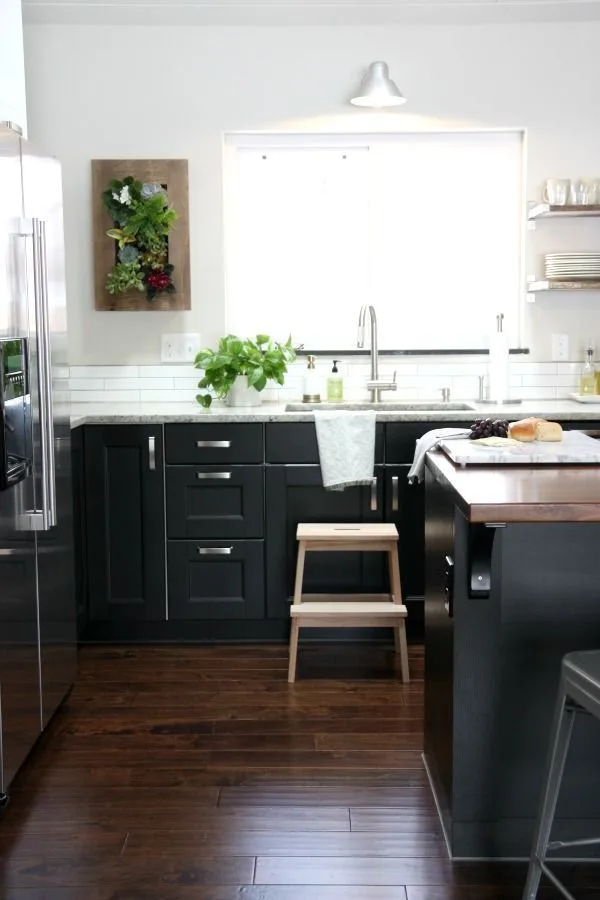
Image source: Web (Bing) / ca.pinterest.com (Web image (fair-use with source credit))
The contrast level also matters. High contrast, like white and black, is dramatic and modern. Low contrast, like cream and light gray, is subtle and calm.
Medium contrast, like white and navy, is the sweet spot for most homes.
The Most Popular Color Pairings and How They Actually Look
White uppers and navy lowers. This is the most popular combination. It's crisp, classic, and works with almost any style. Navy is dark enough to hide wear but not so dark that it feels heavy.
The key is choosing the right white. A pure white works well with a true navy. If your navy has green undertones, go with a warmer white.
Gray uppers and white lowers. This is a popular choice for modern and transitional kitchens. The gray adds depth while the white keeps things light. Warm grays pair well with cream or warm white.
Cool grays look best with bright white. Avoid a gray that's too close to the white in lightness.
Cream uppers and dark green lowers. This is a warmer, more traditional pairing. Cream is softer than white and feels cozier. Dark green adds richness.
This works especially well with natural wood elements or brass hardware.
Black uppers and wood lowers. This is a bold choice for large, well-lit kitchens. The black upper cabinets create a dramatic atmosphere. The wood lowers add warmth and texture.
Choose a wood with visible grain like oak or hickory.
White uppers and wood lowers. This is a classic farmhouse look. The white keeps the room bright, and the wood adds warmth. Warm wood tones like walnut pair well with warm whites.
Cool wood tones like ash pair better with bright white.
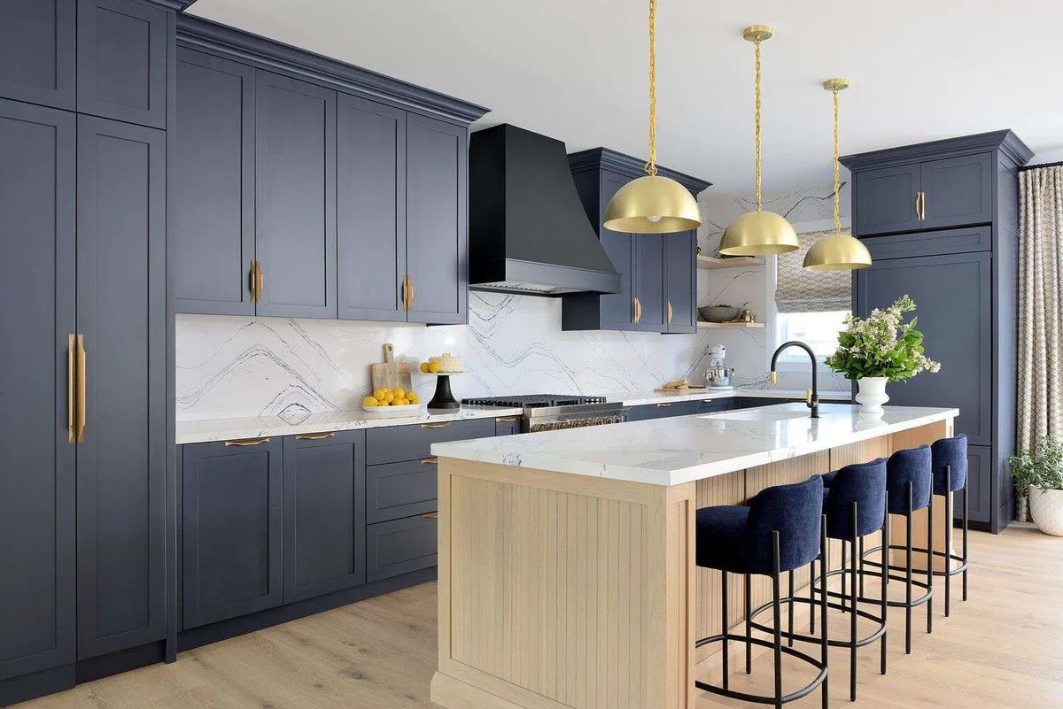
Image source: Web (Bing) / thespruce.com (Web image (fair-use with source credit))
Which Color Scheme Fits Your Kitchen Style and Layout
Modern farmhouse. White uppers and dark navy or charcoal lowers. Add butcher block or quartz countertops. Use black or brass hardware.
Transitional. Gray uppers and white lowers. This is a softer, more neutral take. It works with almost any countertop and backsplash.
Contemporary. High contrast schemes like white and black. Sleek, flat-panel cabinets work best. Use hardware sparingly.
Traditional. Cream uppers and dark green or navy lowers. Raised panel or Shaker doors. Brass or bronze hardware.
Scandinavian. White uppers and light wood lowers. The look is bright and airy. Use open shelving in some areas.
Industrial. Black uppers and wood lowers with visible grain. Metal hardware. Works best in lofts or homes with exposed brick.
Where to Put Each Color: Upper, Lower, Island, or Accent
Upper and lower split. Light uppers, dark lowers. The split happens at countertop level. This is the safest and most versatile option.
Island only. The perimeter cabinets are all one color, and the island is a contrasting color. The island becomes the focal point. This works well in open-concept kitchens.
Accent cabinet. One cabinet or a small run is a different color. This could be a pantry or a bar area. It's a subtle way to add a pop of color.
Upper and lower split with a different island. The uppers are one color, the lowers are another, and the island is a third. Use the island color as a bridge between the two main colors. This works best in large kitchens.
6 Visual Mistakes That Ruin a Two-Tone Kitchen
1. Forgetting the transition line. The best place for the split is at countertop level. The countertop acts as a natural divider.
2. Ignoring the island. The island needs to be intentional. If it's a different color, make sure it ties the two main colors together.
3. Clashing with the backsplash. A neutral backsplash that complements both cabinet colors is safest. White subway tile works with almost everything.
4. Using the wrong finish. Satin or semi-gloss on lowers for durability. Satin or eggshell on uppers for a softer look.
5. Overlooking hardware. Silver or chrome works with cool tones. Brass or bronze works with warm tones.
Black hardware is a neutral that works with most schemes.
6. Not testing in your own lighting. Paint colors look different under different light. Buy sample sizes and paint large pieces of poster board.
Tape them to your cabinets and live with them for a few days.
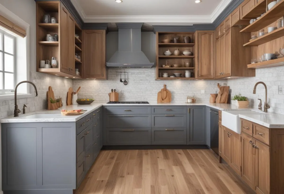
Image source: Web (Bing) / planetcabinets.com (Web image (fair-use with source credit))
How to Choose and Test Your Two-Color Scheme
First, identify your fixed elements. Countertops, backsplash, flooring, and natural light exposure. Each has a color and an undertone.
Second, decide on the mood. Bright and airy? Go lighter.
Cozy and dramatic? Go darker. Balanced and classic?
Stick with medium contrast.
Third, choose a palette of three colors. One for uppers, one for lowers, and one for the island. The island color should tie the two together.
Fourth, test your colors. Buy sample sizes. Paint large pieces of foam board.
Tape them to your cabinets. Live with them for at least three days. Look at them in morning, noon, and evening light.
Fifth, commit. The testing phase is where most mistakes are caught. Skipping it is the fastest way to regret.
Pro Tips for a Professional-Looking Two-Tone Finish
Use a high-quality bonding primer, especially over laminate. Sand lightly between coats with 220-grit paper. Use a paint sprayer or high-density foam roller for the smoothest finish.
Apply two to three thin coats rather than one thick coat. Thick coats can drip or sag. Let the paint cure for at least two weeks before heavy use.
What Two-Tone Cabinets Actually Cost: DIY vs. Pro
| Option | Cost | Timeline |
|---|---|---|
| DIY painting | $200 to $600 | 20 to 40 hours of labor |
| Professional painting | $3,000 to $8,000 | 1 to 2 weeks |
| Cabinet refacing | $4,000 to $10,000 | 1 to 2 weeks |
| Full replacement | $10,000 to $30,000 | 2 to 4 weeks |
DIY saves money but costs time. Professional painting gives a flawless finish faster. Refacing is a middle ground.
Full replacement is the most expensive and disruptive.
Keeping Your Two-Tone Cabinets Looking Fresh
Clean regularly with mild soap and water. Dark lowers show dust and fingerprints more. Light uppers show grease.
A satin finish on lowers is easier to clean.
Good ventilation prevents moisture damage. Add a clear protective topcoat to lowers for extra durability. Avoid harsh chemicals or abrasive cleaners.
Frequently Asked Questions
What is the best two-tone combination for a small kitchen?
White uppers and light gray or soft blue lowers. This keeps the room bright and adds contrast without overwhelming the space.
Can I paint over laminate cabinets?
Yes, but use a bonding primer. Lightly sand the surface first. Apply two coats of primer before painting.
Do two-tone cabinets affect resale value?
Neutral schemes like white and gray are safe. Bold colors can limit your buyer pool. Stick with classic pairings if you plan to sell soon.
Should upper cabinets be lighter or darker than lower cabinets?
Upper cabinets should almost always be lighter. This follows the principle of visual weight. Light colors feel airy and make the ceiling feel higher.
How long does it take to paint two-tone cabinets myself?
Expect 20 to 40 hours for a standard kitchen. This includes prep, priming, painting, and drying time. Plan for at least a full weekend.
What is the most popular two-tone combination in 2026?
White uppers and navy lowers. It's versatile, works with many styles, and has a timeless appeal.